mpltex: A Tool for Creating Publication Quality Plots
This post serves as a tutorial to the mpltex Python package, a tool for producing publication quality plots using matplotlib.
LaTeX formatting for axis titles, legends, and texts in the figure is supported.
The internal matplotlib color cycle is replaced by Tableau classic 10 color scheme which looks less saturated and more pleasing to eyes.
Other available color schemes for multi-line plots are ColorBrewer Set 1 and Tableau classic 20.
mpltex also provide a way to generate highly configurable line styles with colors, line types, and line markers.
Hollow markers are supported.
Creating a publication-quality plot is not an easy job. One needs to consider a dozen of factors:
- The figure size should be set explicitly to match journal specific value. For exmaple, journals published by American Chemical Society (ACS) allows a maximum 3.25-inch width figure for single-column and a maximum 7-inch width figure for double-column.
- The font family should be customized. Most of the time, “Times New Roman” is a safe choice. You should consult the journal author guide for more information.
- The font size also needs to be set properly.
- The linewdith of axis, axis ticks, line arts, the format of legend, the colors are all important factors affects the final looking of a plot.
- The file format of a figure should be chosen carefully. For most publishers, EPS is a good choice for line arts and other simple 2D arts, such as histograms, power spectra, bar charts, errorcharts, scatterplots.
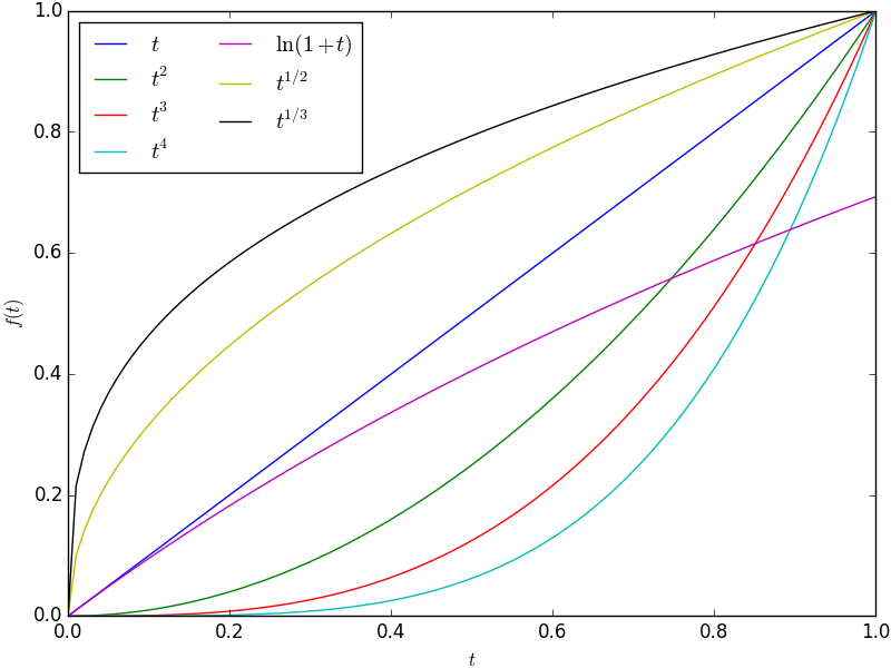
Matplotlib, a Python 2D plotting library, is an amazingly flexible tool to create scientific plots. You can create various 2D arts with just a few lines of Python code. A plot created by the default settings of matplotlib looks like
The code for producing the above plot is
1
2
3
4
5
6
7
8
9
10
11
12
13
14
15
16
17
18
19
20
21
22
import numpy as np
import matplotlib.pyplot as plt

def my_plot(t):
    fig, ax = plt.subplots(1)
    ax.plot(t, t, label='$t$')
    ax.plot(t, t**2, label='$t^2$')
    ax.plot(t, t**3, label='$t^3$')
    ax.plot(t, t**4, label='$t^4$')
    ax.plot(t, np.log(1+t), label='$\ln(1+t)$')
    ax.plot(t, t**(1./2), label='$t^{1/2}$')
    ax.plot(t, t**(1./3), label='$t^{1/3}$')

    ax.set_xlabel('$t$')
    ax.set_ylabel('$f(t)$')
    ax.legend(loc='best', ncol=2)
    fig.tight_layout(pad=0.1)
    fig.savefig('matplotlib-raw')

t = np.arange(0, 1.0+0.01, 0.01)
my_plot(t)
plt.close('all')
This plot is obviouly not ready for journal publication. The font size is too small. The line width for axes, ticks, and profiles are too thin. I also don’t like the border around the figure legend. And the line colors are too saturated and are not pleasing to look at.
To fix all these problems, I developed a Python package, mpltex, to customize the behavior of matplotlib for creating publication-quality plots. With mpltex, one can easily generate the following plot perfectly fufilled the requirements of ACS journals
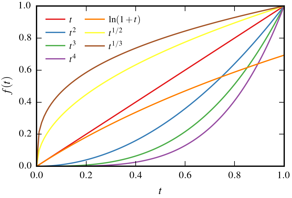
by just adding ONE LINE (besides the import package line import mpltex) before the definition of funciton my_plot in the above code block
@mpltex.acs_decoratorThis line uses the decorator @acs_decorator from mpltex to decorate the function my_plot.
Currently, mpltex (v0.6.1) provides five decorators: @acs_decorator, @aps_decorator, @rsc_decorator, @presentation_decorator, and @web_decorator. @acs_decorator, @aps_decorator, and @rsc_decorator are designed for creating plots for journals published by American Chemical Society (ACS), American Physical Society (APS), and Royal Society of Chemistry (RSC), respectively. Journals from other publishers are yet to be supported. Hopefully, other decorators for this purpose will be available in the near future. @presentation_decorator creates plots in the PDF format and is suitable to be incorporated in presentation slides (especially convenient for Keynote and Beamer). @web_decorator produces plots in the PNG format to be used in webpages.
In addition to these decorators, mpltex also provides a convenient generator, linestyle_generator, to generate various line styles to help create line arts with markers. The following codes convert the above plot into line profiles with different line styles and line markers. (To use following codes, please update to mpltex v0.6.1 or later.)
1
2
3
4
5
6
7
8
9
10
11
12
13
14
15
16
17
18
19
20
21
22
23
24
25
26
import numpy as np
import matplotlib.pyplot as plt

import mpltex

@mpltex.acs_decorator
def my_plot(t):
    fig, ax = plt.subplots(1)
    linestyles = mpltex.linestyle_generator()
    ax.plot(t, t, label='$t$', **next(linestyles))
    ax.plot(t, t**2, label='$t^2$', **next(linestyles))
    ax.plot(t, t**3, label='$t^3$', **next(linestyles))
    ax.plot(t, t**4, label='$t^4$', **next(linestyles))
    ax.plot(t, np.log(1+t), label='$\ln(1+t)$', **next(linestyles))
    ax.plot(t, t**(1./2), label='$t^{1/2}$', **next(linestyles))
    ax.plot(t, t**(1./3), label='$t^{1/3}$', **next(linestyles))

    ax.set_xlabel('$t$')
    ax.set_ylabel('$f(t)$')
    ax.legend(loc='best', ncol=2)
    fig.tight_layout(pad=0.1)
    fig.savefig('mpltex-acs-line-markers')

t = np.arange(0, 1.0+0.05, 0.05)
my_plot(t)
plt.close('all')
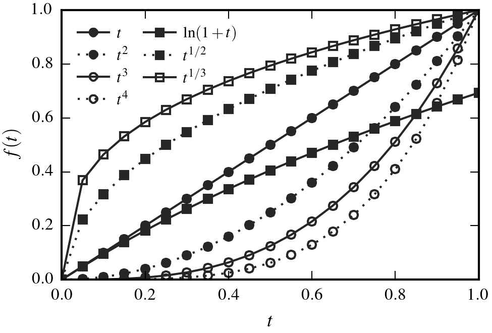
The resulted plot should look like
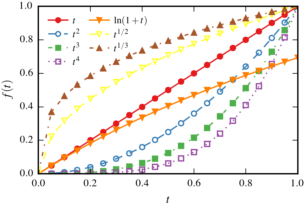
This plot is created by the default linestyle_generator. linestyle_generator has four arguments: colors, lines, markers, and hollow_styles. All are Python iterables (list, tuple, or other iterable objects). If you don’t want to cycle one of these, just pass an empty list or None to that argument. Below are examples of some most useful line-art styles.
Plot created by mpltex, cycling colors and line markers using
linestyles = mpltex.linestyle_generator(lines=[])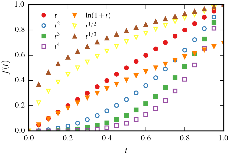
Plot created by mpltex, cycling colors and line styles using
linestyles = mpltex.linestyle_generator(markers=[])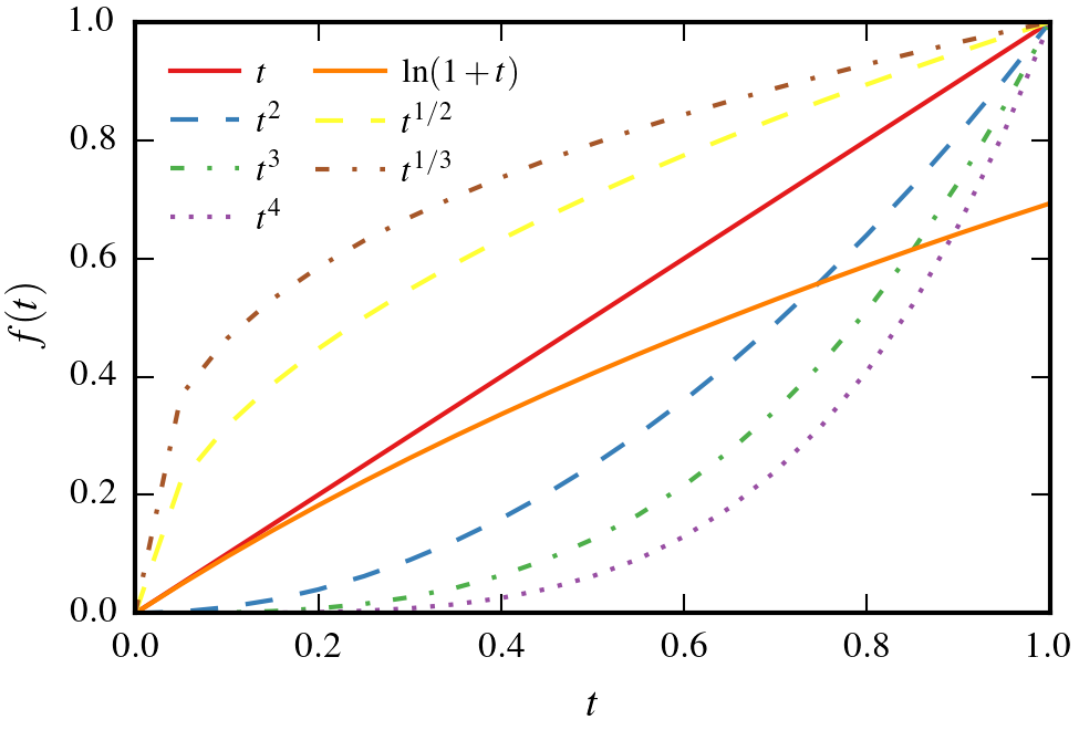
Plot created by mpltex, cycling colors and filled markers using
linestyles = mpltex.linestyle_generator(lines=[], hollow_styles=[])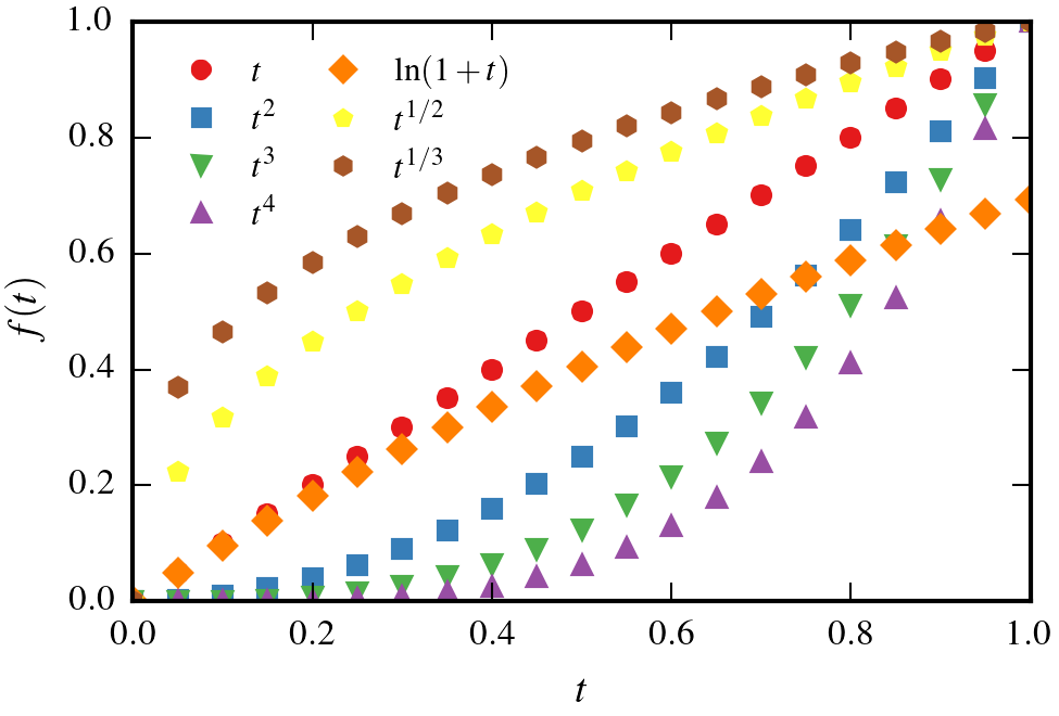
Plot created by mpltex, cycling colors, line styles and filled markers using
linestyles = mpltex.linestyle_generator(hollow_styles=[])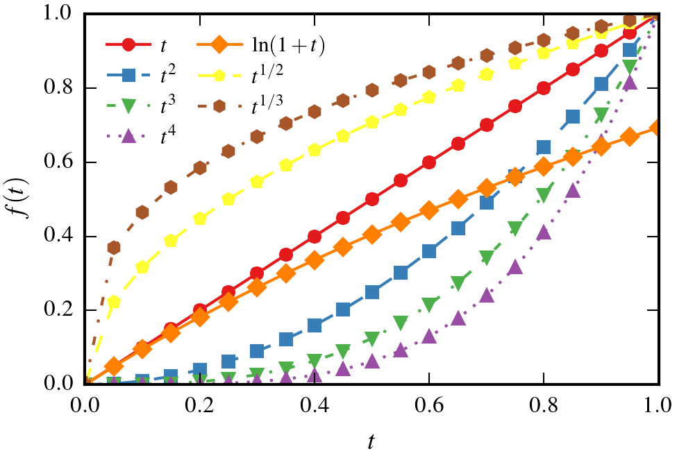
Plot created by mpltex, cycling colors and filled markers connected by solid lines using
linestyles = mpltex.linestyle_generator(lines=['-'], hollow_styles=[])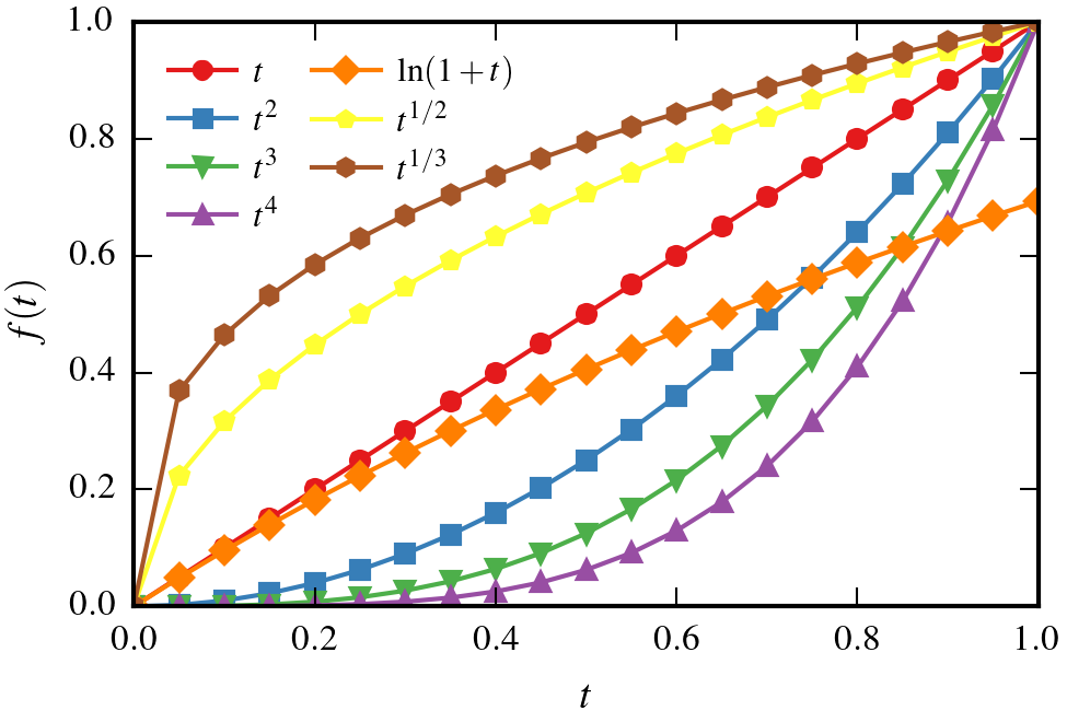
Plot created by mpltex, cycling all markers connected by solid lines using
linestyles = mpltex.linestyle_generator(lines=['-'])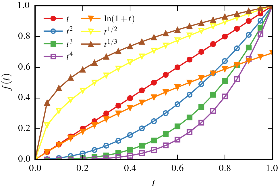
And you can do something really cool by passing some specially designed combo arguments, such as
linestyles = mpltex.linestyle_generator(colors=[],
                                        lines=['-',':'],
                                        markers=['o','s'],
                                        hollow_styles=[False, False, True, True],)
This will create a black-white line art containing selected line styles and markers.